
Choosing the right interior colour palette for your living room isn’t just about following trends; it’s about creating a space that feels like home. With colours capable of transforming a room from bland to beautiful, selecting the perfect interior design colour palette is crucial. From how to add colour to your living space to which popular colours to use, here is some useful inspiration that will help you transform your home this year.
How to Decide On The Best Interior Colour Palette For Your Living Room
Find interior design inspiration

The first step in your colour selection journey is to seek inspiration from a variety of sources. Digital platforms like Pinterest and Instagram are treasure troves of interior design ideas and offer endless image inspiration for styled rooms to spark your creativity. Creating a Pinterest board can help you easily compile your favourite ideas and experiment with different colour combinations and themes until you find a colour palette for your interior that speaks to you.
Consider how light can affect colour
Lighting plays a pivotal role in how colours appear in your living room as both natural and artificial light can alter how a colour looks in your home. The same shade will look different around your home depending on how much light it receives. For rooms bathed in sunlight, cooler tones can help create balance. In darker spaces or those with limited natural light, warmer, lighter colours can make the room feel brighter and more inviting.
Think about your application
When it comes to improving your home, there are many different ways that you can add colour to your interiors for a brand-new look. From the walls and floors to soft furnishings and accessories, it’s important to decide early on how you plan to distribute your interior colour palette. Will you opt for a bold wall colour, or keep the walls neutral and inject colour through textiles and decor? Remember, the application of colour can significantly affect the room’s overall mood and style.
Only focus on a few colours
The 60-30-10 rule is a timeless guideline in interior design and helps to promote a balanced use of colour. This useful interior design rule suggests using a dominant shade for 60% of the room, a secondary colour for 30%, and an accent colour for the remaining 10%. Selecting one key colour and a few complementary or accent shades can prevent the space from feeling chaotic and ensure a harmonious and cohesive look.
Popular Interior Colour Palettes To Try In Your Living Room
Calming Pastels
Pastel hues, with their soft and soothing qualities, are perfect for creating a tranquil living space. These light, washed-out colours pair beautifully with soft textures and natural materials, fostering a serene and inviting environment. From delicate pinks to soft lavenders, add some personality to your home by painting your walls or wood panelling to embrace these colours in your living room.
Earthy Neutrals
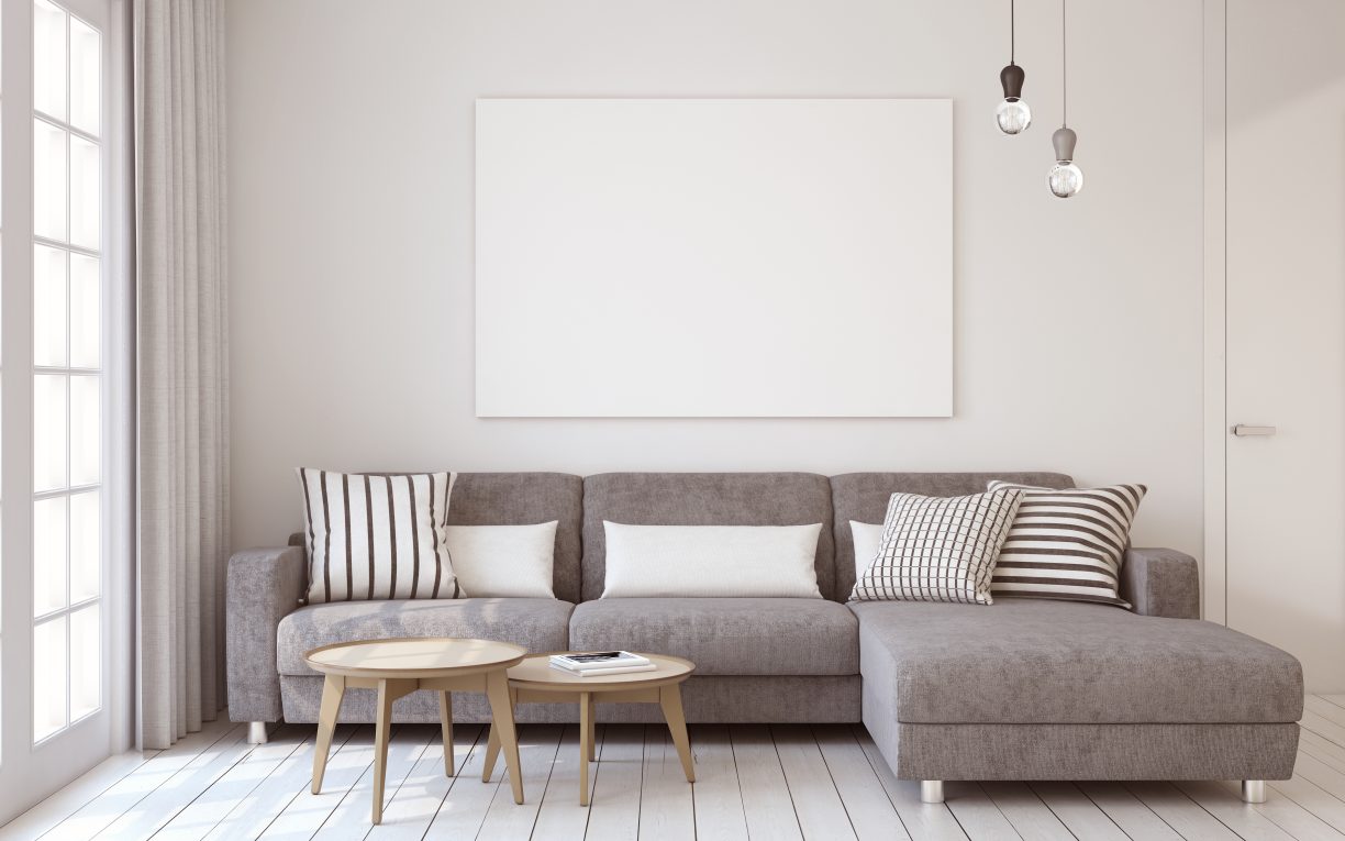
When redecorating your home, why not experiment and embrace the beauty of the simplicity of an earthy neutral colour palette? These colours, ranging from soft beiges to rich terra cottas, can bring warmth and versatility to your living room. Earthy neutrals serve as a solid foundation, allowing for easy updates with colourful accents and ensuring your space remains timeless.
Bold Monochrome
For a dose of sophistication in your living space, consider using a monochrome palette. This timeless approach uses varying shades of a single colour to create depth and interest. If you’re thinking about decorating your living room with black, pairing it with white can help create an elegant and visually intriguing monochromatic interior colour palette. By playing with textures and patterns within a black-and-white scheme, you can add complexity to the room, preventing it from feeling flat or monotonous.
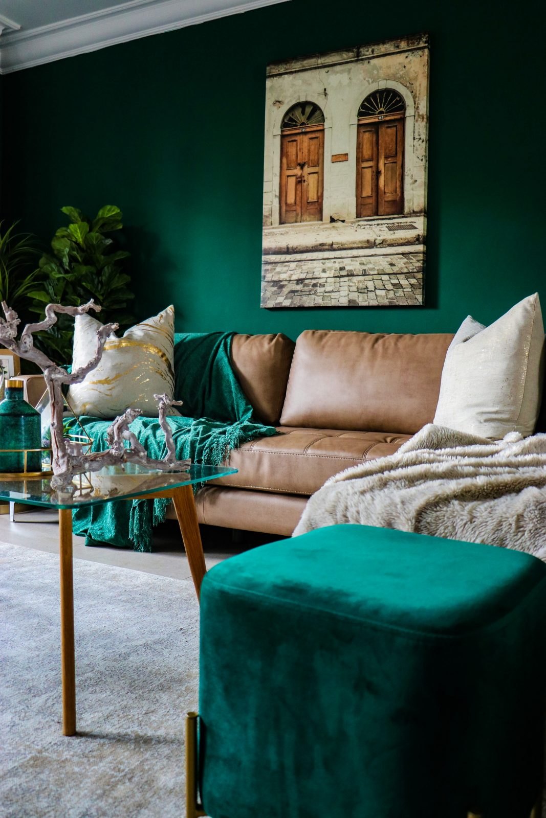
Photo by Devon Janse van Rensburg on Unsplash
Rich Jewel Tones
Beautiful jewel tones, like emerald green, sapphire blue, and ruby red, can introduce vibrancy and a touch of luxury to your living room. These saturated hues can make bold statements when used as accent colours or create a cosy, enveloping feel when applied more liberally. Decorating your living space with rich jewel tones can be as easy as cosy cushions and throws for the sofa or can be used as an eye-catching focal wall. Pairing jewel tones with neutral backgrounds can also highlight their richness without overwhelming the space.
Experimenting With Colour In Your Living Room
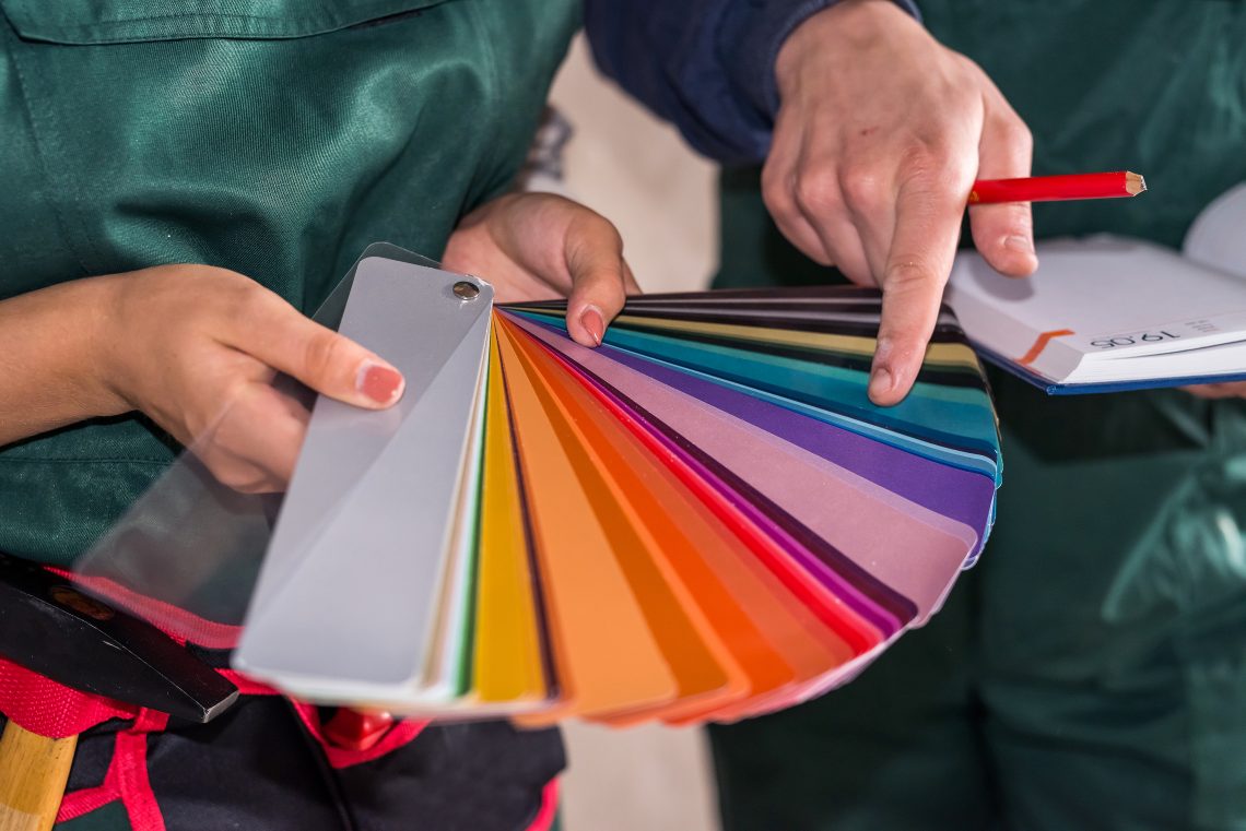
Selecting the right interior colour palette for your living room allows you to express your personal style while creating a cohesive and welcoming space. Remember, the best palette is one that resonates with you, offering comfort and joy every time you enter the room. Don’t be afraid to experiment with samples and swatches to discover the perfect combination that feels just right. Discover useful interior inspiration and tips online and in stores to help you decide which living room colours feel right for you!
Read more home decor articles at ClichéMag.com
Images provided by Deposit Photos, BingAI, Adobe Stock, Unsplash, Pexels, Pixabay & Creative Commons