Wedding planning presents countless decisions, yet few prove as visually impactful as colour selection. The colours you choose ripple through every element of your celebration—from invitations and floral arrangements to bridesmaids’ dresses, table linens, and decorative accents. A well-conceived colour scheme creates visual harmony that ties disparate elements together, transforming individual components into a cohesive, memorable aesthetic. Conversely, poorly coordinated colours create disjointed appearances where elements compete rather than complement, diminishing the overall impact regardless of individual quality. Understanding colour theory fundamentals, current trends, seasonal considerations, and practical application strategies empowers couples to create wedding aesthetics that reflect their personal style whilst ensuring visual coherence across all touchpoints. Whether planning intimate gatherings or grand celebrations, mastering colour coordination elevates the entire event through thoughtful, intentional design choices.
Fundamentals of Wedding Colour Schemes
Understanding Colour Relationships
Successful wedding colour schemes typically incorporate three to five colours working in deliberate relationships. Base colours provide dominant visual presence across major elements including bridesmaids’ attire and table linens. Accent colours appear in smaller doses through floral arrangements, stationery, and decorative details, adding visual interest without overwhelming. Neutral anchors in whites, creams, greys, or metallics ground schemes whilst providing visual rest between bolder colours.
Analogous colour schemes use colours adjacent on the colour wheel—blues and greens, or pinks and oranges—creating harmonious, naturally coordinated aesthetics with subtle variation. Complementary schemes pair opposite colours like purple and yellow, delivering dynamic contrast that energises spaces when balanced carefully. Monochromatic approaches explore different shades and tones within single colour families, creating sophisticated, cohesive looks through variation in depth and intensity rather than hue diversity.
Balancing Bold and Subtle Elements
The key to successful colour implementation lies in strategic distribution rather than uniform intensity throughout. Concentrating bold colours in specific focal points—a dramatic floral installation, striking bridesmaid wedding dresses, or colourful table centrepieces—creates impact whilst allowing softer tones to dominate elsewhere. This prevents colour fatigue where excessive boldness throughout overwhelms rather than delights, whilst ensuring distinctive colours receive appropriate emphasis.
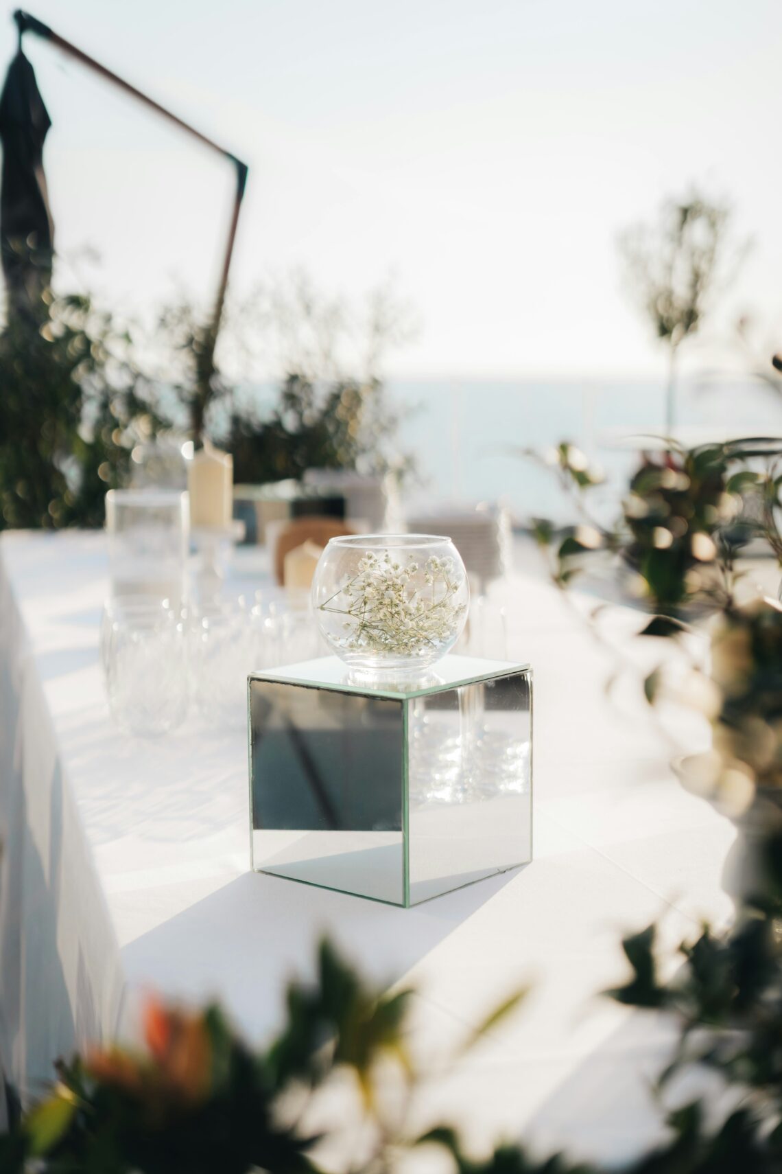
Metallic accents in gold, rose gold, silver, or copper add dimension and visual interest without contributing additional hues to schemes. These reflective elements catch light beautifully, elevating perceived luxury whilst remaining neutral enough to complement virtually any colour combination. Incorporating metallics through candleholders, charger plates, cutlery, or decorative accessories provides elegant finishing touches that enhance without dominating colour narratives.
Seasonal Considerations and Natural Inspiration
Spring and Summer Palettes
Warm-weather weddings naturally embrace lighter, brighter colour schemes reflecting seasonal blooms and sunshine. Spring celebrations often feature soft pastels including blush pinks, lavenders, mint greens, and buttery yellows that echo new growth and fresh beginnings. These gentle tones create romantic, ethereal atmospheres particularly effective for garden or outdoor ceremonies where colours harmonise with natural surroundings.
Summer allows bolder interpretations with saturated jewel tones, vibrant corals, sunny yellows, and deep blues that complement long daylight and outdoor celebrations. These confident colours photograph beautifully in natural light whilst creating energetic, joyful atmospheres appropriate to summer’s exuberance. Incorporating white or cream as dominant neutrals prevents colour saturation from becoming overwhelming, maintaining sophistication alongside vibrancy.
Autumn and Winter Schemes
Cooler months invite richer, deeper colour palettes reflecting seasonal shifts and cosy indoor celebrations. Autumn weddings embrace warm earth tones including burnt oranges, deep burgundies, golden yellows, and chocolate browns that mirror falling leaves and harvest abundance. These colours create intimate, warm atmospheres particularly effective in venues with natural wood elements or rustic characteristics that complement autumnal palettes naturally.
Winter celebrations often explore sophisticated combinations of deep jewel tones—emerald greens, sapphire blues, ruby reds—paired with metallics and crisp whites evoking luxury and elegance. Alternatively, soft winter palettes in dusty blues, silver greys, and icy pinks create ethereal, romantic atmospheres reminiscent of winter’s quiet beauty. These cooler tones photograph gorgeously against winter light whilst offering fresh alternatives to traditional red and green holiday associations.
Practical Application Across Wedding Elements
Translating Schemes into Reality
Once colour schemes are established, translating them consistently across diverse elements requires careful planning and communication. Creating physical swatches or digital mood boards consolidating colours helps ensure all vendors—florists, stationers, decorators, and caterers—understand your vision clearly. Visual references prove far more effective than verbal descriptions subject to individual interpretation, preventing mismatches that compromise cohesion.
Prioritise colour application by visual impact and budget allocation. Major elements including bridesmaids’ attire, floral arrangements, and table settings deserve primary colour consideration as they dominate visual impressions. Secondary elements like invitations, favours, and subtle decorative accents incorporate accent colours economically whilst maintaining scheme coherence. This hierarchical approach ensures essential elements align properly before addressing minor details.
Florals as Colour Anchors
Flowers represent perhaps the most crucial colour component in weddings, appearing throughout ceremonies and receptions in multiple configurations. However, natural variation means achieving exact colour matches proves impossible—the same flower variety exhibits colour range influenced by growing conditions, season, and individual blooms. Embracing this natural variation rather than demanding impossible precision creates more realistic expectations and often more interesting, organic-looking arrangements.
Working with experienced florists familiar with seasonal availability ensures colour goals align with practical realities. Some colours prove challenging or impossible during certain seasons, requiring substitutions that knowledgeable florists suggest whilst maintaining scheme integrity. For inspiration on how colours work together across complete wedding settings, exploring popular wedding colour palettes provides visual examples showing coordinated elements from linens to florals working harmoniously.
Personalisation and Meaningful Colour Choices
Beyond Trends to Personal Significance
Whilst understanding current trends provides helpful inspiration, the most meaningful wedding colour schemes reflect couples’ personal preferences, shared experiences, or significant symbolism rather than slavishly following fashion. Colours representing university teams, favourite travel destinations, or meaningful moments in your relationship create authentic, personal aesthetics that resonate more deeply than generic trendy combinations.
Cultural traditions and family heritage also inform colour choices meaningfully. Incorporating colours significant within cultural contexts or family histories honours traditions whilst creating distinctive aesthetics. These personal connections provide conversation starters and deeper meaning beyond surface aesthetics, enriching your celebration through intentional, thoughtful colour selection rooted in identity and values.
Adapting Colours to Venue Characteristics
Venue architecture, existing décor, and natural surroundings significantly influence how wedding colours appear and function. Historic buildings with strong architectural colours or ornate details may overwhelm if wedding colours compete rather than complement existing aesthetics. Similarly, garden venues with specific plantings or natural colour palettes work best when wedding colours harmonise with rather than fight against surroundings.
Visiting venues at various times considering lighting changes throughout days and seasons helps visualise how colours will appear during actual celebrations. Afternoon sunlight creates different colour appearances than evening artificial lighting, whilst seasonal variations affect natural light quality substantially. Understanding these factors prevents colour selections that photograph or appear differently than anticipated, ensuring schemes deliver intended effects under actual celebration conditions.
Coordinating Wedding Party Attire
Bridesmaid Dress Strategies
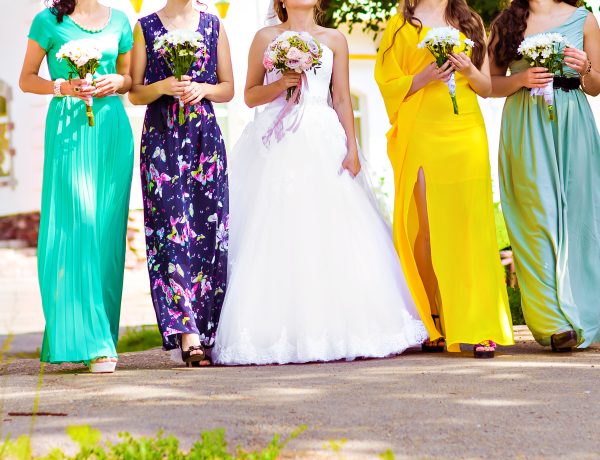
Modern bridesmaids’ attire moves beyond identical dresses in single colours toward coordinated approaches allowing individual expression within cohesive colour schemes. Mixing dress styles in matching colours, varying shades within colour families, or incorporating patterned fabrics alongside solids creates visual interest whilst maintaining harmony. This flexibility accommodates different body types, personal preferences, and budgets more successfully than rigid uniformity.
Providing colour swatches or specific colour names from dress retailers ensures bridesmaids select appropriately coordinated attire even when purchasing independently. However, accepting slight variation between different fabric types or manufacturers prevents frustration chasing impossible perfect matches. Viewing the wedding party as collective composition rather than identical units creates more interesting, contemporary aesthetics whilst reducing stress around perfect coordination.
Groomswear and Accessory Coordination
Groomsmen traditionally wear more uniform attire than bridesmaids, though opportunities exist for colour incorporation through accessories including ties, pocket squares, socks, or boutonnieres. These smaller elements introduce wedding colours subtly without overwhelming the typically neutral suits or dinner jackets that remain appropriate for formal wedding celebrations. Coordinating these accessories with bridesmaid colours creates visual cohesion across wedding parties.
Metallic elements including watch finishes, cufflinks, or tie bars should coordinate with chosen metallic accent colours for comprehensive cohesion. These details appear subtle individually but collectively contribute to polished, thoughtfully coordinated aesthetics. Providing specific accessory guidance or even purchasing items as groomsmen gifts ensures coordination whilst removing decision-making burden from wedding party members unfamiliar with formal attire conventions.
FAQ Section
How many colours should a wedding palette include?
Most successful schemes incorporate three to five colours including one or two dominant base colours, one or two accent colours, and neutral anchors. More colours risk appearing chaotic, whilst fewer may seem monotonous. This range provides sufficient variety for visual interest without overwhelming coordination challenges.
Should wedding colours match exactly across all elements?
Perfect matching proves impossible and often undesirable—natural variation in materials, lighting, and seasonal availability creates subtle differences that add depth and interest. Instead, aim for complementary tones within colour families that coordinate without demanding impossible precision.
How do I incorporate wedding colours without overwhelming spaces?
Use bold colours strategically in focal points whilst allowing neutral tones to dominate overall. Concentrate colours in specific elements—floral centrepieces, bridesmaids’ attire, or feature décor—whilst surrounding areas remain neutral. This creates impact without colour fatigue.
Can I mix warm and cool tones in one palette?
Yes, though careful balance prevents clashing. Metallic accents often bridge warm and cool colours successfully, whilst maintaining one temperature as dominant with the other as accent typically works better than equal proportions competing for dominance.
Should my wedding colours reflect the season?
Not necessarily, though seasonal coordination often proves easier as available wedding flowers and natural lighting complement seasonal palettes. However, personal preference trumps seasonal expectations—winter pastels or summer jewel tones work beautifully when executed thoughtfully with appropriate floral and décor selections.
Conclusion
Creating cohesive wedding colour schemes requires balancing aesthetic vision with practical realities including seasonal flower availability, venue characteristics, and budget constraints. Successful colour coordination extends beyond merely selecting favourite colours to understanding how hues interact, distribute across diverse elements, and appear under varying lighting conditions throughout celebrations. By approaching colour selection strategically—establishing clear hierarchies, embracing natural variation, and prioritising personal meaning over generic trends—couples create distinctive aesthetics that feel both cohesive and authentically representative of their style. Whether drawn to soft romantic pastels, bold jewel tones, or sophisticated neutrals, the principles explored here provide frameworks for translating colour inspiration into comprehensive wedding aesthetics that delight throughout planning processes and create lasting visual impressions for couples and guests alike. Remember that whilst coordination matters, perfection proves less important than creating atmospheres that feel genuinely celebratory and authentically yours.
Read more lifestyle articles at ClichéMag.com
Images provided by Deposit Photos, BingAI, Adobe Stock, Unsplash, Pexels, Pixabay Freepik, & Creative Commons. Other images might be provided with permission by their respective copyright holders.


