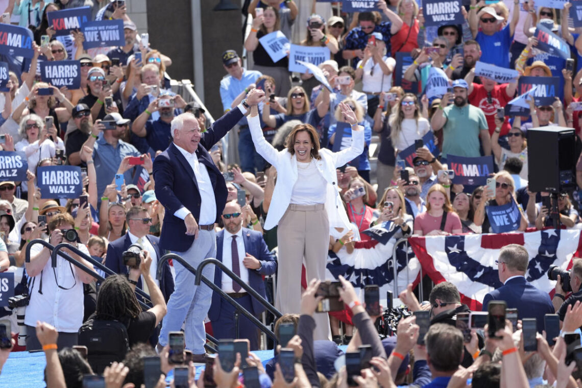
A new poster for Democratic presidential nominee Kamala Harris and her running mate Tim Walz’s campaign tour looks familiar. It’s not duplicative of a previous high-profile political campaign and it’s not reminiscent of what the Biden-Harris ticket branding looked like before the president announced he wasn’t running for reelection. It’s a look more commonly found outside of the political realm: It looks like a concert poster.
The campaign poster might be right at home among the T-shirts and hats at a concert merch tent, adorned with photos of a cheering crowd and a list of future tour dates. There’s a grainy quality to the photos — a coveted look many people on Instagram try to achieve by using filters.
The look is intentional, Scott Starrett, founder of the design company Tandem, told Yahoo Entertainment. Starrett, who has worked on political campaigns before, co-created the materials for Alexandria Ocasio-Cortez’s first congressional campaign, in 2017, with designer Maria Arenas.
“I do think there’s a bit of buzz in the concert poster reference,” Starrett said, pointing to the photos of the cheering audiences alongside Harris and Walz. “They are putting the people squarely in the front. The people are the primary component in this poster, the enthusiasm of folks.”
Hunter Schwarz, a journalist who covers political design and art, wrote in his newsletter Yello in May that campaign logos and merchandising matter to voters — right down to how the font makes them feel.
“Political design doesn’t exist in a vacuum,” Schwarz told Yahoo Entertainment. “Design trends inside and outside of politics influence each other. Trends from pop culture rub off.”
The concert poster parallel also aligns with the pop culture inflection points the campaign has embraced, with the internet dubbing Harris a “brat,” referencing singer Charli XCX’s recent album, and Walz a “Midwest princess,” referring to the title of Chappell Roan’s 2023 album, The Rise and Fall of a Midwest Princess.
“They’re absolutely trying to maximize on that stardom component,” Starrett explained. “Posters for music venues have a certain feel. That’s partly due to its utility and partly due to folks repeating design patterns so that folks know what they’re in for.”
The Harris campaign had a very short turnaround time to establish the look and feel of a campaign after President Biden dropped out of the 2024 race for the White House and endorsed his vice president. By leveraging design patterns that are familiar to the general public, such as a concert poster, Starrett argued, it makes prospective voters feel comfortable.
Starrett compares it to former President Barack Obama’s “O” logo for his 2008 presidential campaign. The “O” logo could stand alone and voters knew who it was referring to and what it meant.
“The Obama campaign really brought design into politics in a way that it hadn’t been before,” Starrett said. “So all of this is everyone standing on the shoulders of giants.”
Harris doesn’t have that type of advantage.
“The Harris campaign doesn’t have time to create a logo similar to the Obama campaign, or even Hillary’s ‘H,’ [from her 2016 campaign]” Starrett said. “They are, out of necessity, [doing] form following function. They’re using this urgency to use references.”
After a summer of major concert tours — such as Taylor Swift’s “Eras Tour,” Beyoncé’s “Renaissance World Tour” and the record-breaking crowd in attendance at Roan’s Lollapalooza set — Schwarz says it makes sense music would influence politics. He pointed to Kid Rock’s performance at the Republican National Convention as proof that, for both sides, pop culture and politics are naturally intertwined.
While the Harris campaign is in its early days, having launched on July 21, there’s somehow a nostalgic element to the poster design as well. Wide Eye Creative, the creative agency that designed the look for Harris’s first presidential campaign in 2020, has the case study it used to create her initial branding on its website. It’s clear how much of the inspiration behind her initial branding has influenced her current branding.
Wide Eye Creative’s mood boards for Harris’s 2020 run include famous artworks and architecture, as well as posters of Muhammad Ali — all forms of culture and entertainment as inspiration.
There is a clear nod to the past, too, with Wide Eye wanting to create a “through line between Kamala Harris’s then-impending candidacy and Shirley Chisholm’s historic run in 1972 as the first African American woman presidential candidate in U.S. history,” its website said.
“Similarly with the AOC posters, we’re thinking about what is something that’s entertaining but also kind of combative,” Starrett said. “How do you make a sweatshirt that somebody actually wants to wear that also communicates a values system and a values set?”
Enter the now infamous Harris-Walz camo hat. As of Aug. 8, the campaign has sold almost 50,000 hats, totaling over $1.8 million since they were made available for purchase online two days earlier, Teen Vogue reported. It’s not at all traditional politician merchandise — usually red, white and blue — and is similar in design to merchandise Roan sells at her concerts.
The hats are a clear parallel and response to the Trump campaign’s red “Make America Great Again” hats, which have been around since July 2015. (The Trump campaign website also sells camo hats with the campaign slogan.)
“[The Harris campaign] is leaning less on having this single image that represents the campaign,” Schwarz said. “It sets up this contrast of a Democratic candidate who’s kind of doing something new from a design standpoint and a Republican candidate who has this long-lasting brand adapted for a new campaign.”


