Written by Alice Smith
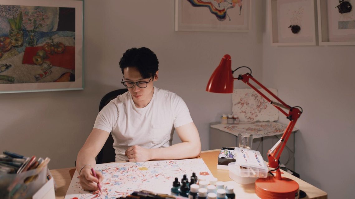
There is nothing more satisfying than obtaining progress in one’s personal growth and professional skills at the same time. Visual artist Tong Wang developed his client-oriented principles and established his own minimalist trend in the exploration of visual art. Being able to do what he wants to do without distractions is one of the secrets of Tong’s success.
Q: Would you please briefly introduce yourself?
A: I’m a visual designer. My focus is on visual design, which includes user experience design, visual identity, as well as illustration, which is more like a combination of user experience prioritization and product design, to help my clients achieve their business goals. I majored in Illustration at Parsons School of Design for my Bachelor, and studied Digital Media Design for Learning at New York University for my Master. I was actually in another Master program of Art, Education and Community Practice, which is more on the public education-wise. But considering visual design is where my interest lies and the trend in user experience of interaction design, I decided to transfer to Digital Media Design for Learning so I can focus on something that I’m interested in.
Q: What are your main responsibilities right now at Halo Media?
A: I am mainly responsible for website design in regards to the different needs of my clients. For example, every time when a client has an event going on, I will be asked to create a website for this event following the standard of their official website. And there are a few elements that have to be included when designing such as the ticket channel, artist information, related events, and peripheral products, which is like building a portfolio for artists like me. Usually the inspiration comes pretty fast because each client has their own style that’s set up and I just need to follow the same routine. But there are times where some of them may not have a clue or are trying to do something new. And on that occasion I will go to their social media page and look at the posters and other information to get an idea of what they are looking for.
Q: How did you come up with the logo design of Bad Monster
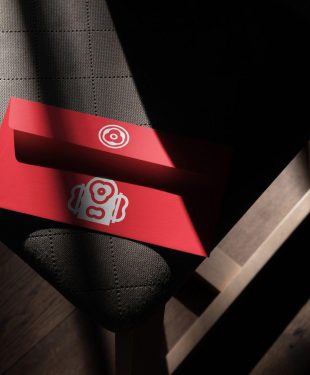
A: The first thing that came to my mind was to highlight the concept of monster in my design. And in order to do that, I knew I had to find a connection between the skateboard and the monster itself. After I closely observed the skateboard, I came to realize two critical components, which are the balance and the screws. Skateboarding itself is all about finding the balance. And there were so many screws on both sides of the skateboards. Small ones circled by big ones, which reminded me of human eyes. This was where I drew my inspiration from. As for the colors, I provided my client with a bunch of different color combinations. We eventually picked black and red because these two colors give out a vibe that’s more closely attached to the monster theme.

Q: What do you think differentiates your minimalism from other minimalist designers?
A: My depiction of minimalism is a spiritual discussion. In other words, I see it as my emotional support that keeps reminding me to focus on what I’m doing and do not overthink. As a matter of fact, each artist grows up in different environments and has different views toward a lot of things. We draw inspiration from different things in life, too. But the common thing is that we all get lost at some point in life. I sometimes feel like this is not my life. I feel lonely living in such a big city so I was also trying to present the loneliness, sorrow and pain, which are, in my opinion, the best source of art. The more comfortable one’s life is, the harder it is to create great art. And at the same time, it also represents my desire for happiness.
Q: How did you deal with the occasions where you and your client have disagreements?
A: I did encounter a lot of challenges like that but now I’m able to handle them better. Art creation in business is a little different because my focus will be on how to fulfill my client’s needs instead of a full creation of my own. When I was younger, I didn’t fully understand the balance between visual art, business and marketing. If there’s any disagreement between me and my client, I wouldn’t step back because I believed my proposal was better. But now I realized that it doesn’t really matter whether me and my client are on the same page, what matters is that if I can give them the answer they want. I can understand their needs and generate a solution to meet their needs, supporting them to achieve their business goals. Most importantly, I respect the artistic identity of each individual because everyone can be an artist. I don’t want them to feel like that only what artists like are called art. The most important thing is to recognize the diversity of art.
Read more interviews at ClichéMag.com
Images provided by Flickr, Unsplash, Pexels, Pixabay & Creative Commons


